

Purpose
dYdX is dedicated to designing technology that will enable a fast, intuitive, and powerful trading experience for all. The goal is to empower traders with a modular and responsive interface that allows you to trade quickly and efficiently, no matter where you are, or what device you’re using. In this post, you’ll find a deep dive into unique features of our user interface.
History
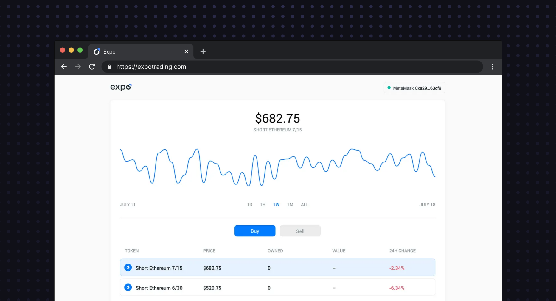
dYdX has undergone four major evolutions over time. It initially took the form of an onchain token with Solo (e.g., sETH for shorting ETH), with a minimal interface to trade into and out of these tokens.
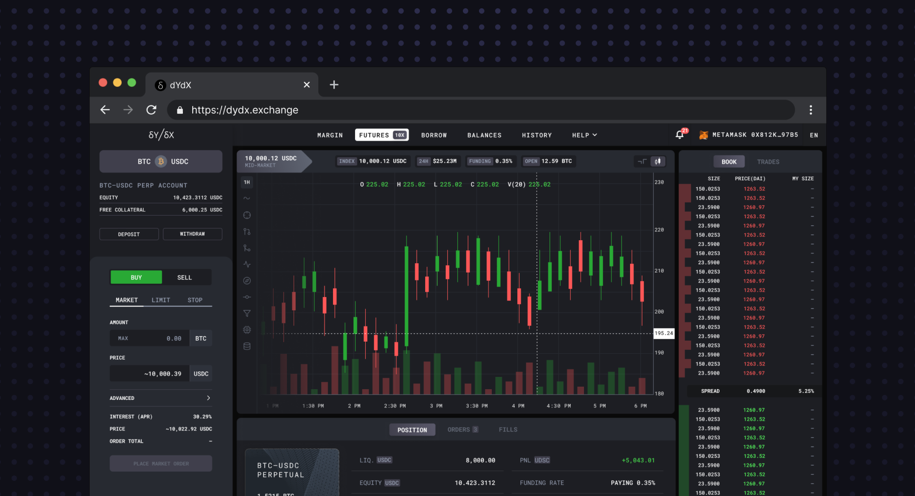
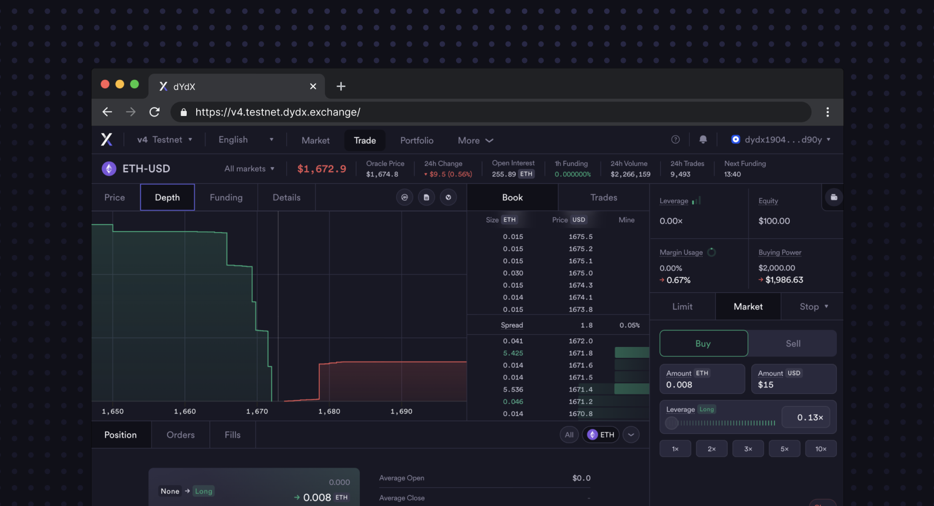
With v2, dYdX evolved into an onchain margin exchange, with the interface taking on the form of a pro trading interface, featuring order books and price charts for the smart-contract based markets, and a simple lending interface.
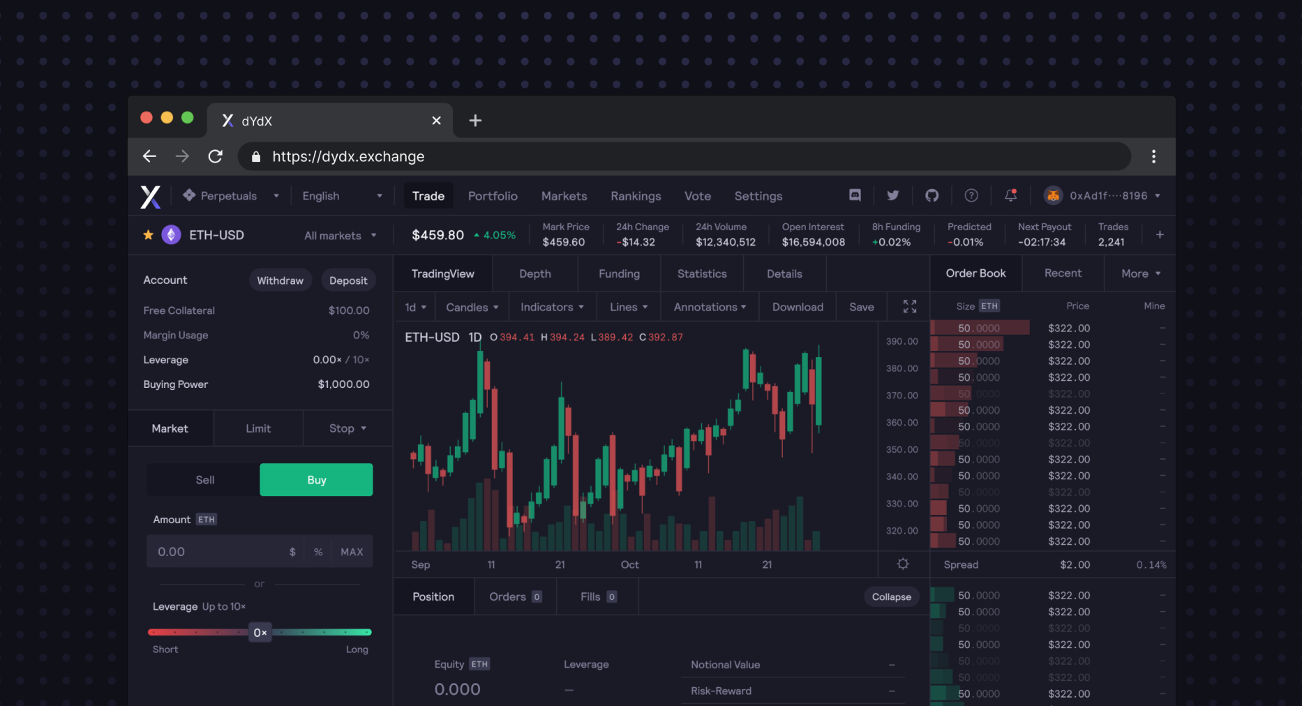
With v3, the platform shifted its attention to low-latency trading via the StarkEx platform, bringing many advanced features, and a focus on perpetual contracts, as well as the launch of Leagues and Hedgies.
With the upcoming release of v4, dYdX will be open sourcing software. The frontend will be decentralized and incorporate even more design refinements, markets, and features.
If you’re interested in reading more about the history of dYdX, read Antonio’s post here.
Principles
dYdX approaches the design of the frontend trading platform with three key principles in mind.
Reliable information architecture can reinforce trust. Traders should be provided with critical data points and inputs upfront, and have the ability to revert or cancel with the help of persistent summaries of information across steps. Frequent actions should take no more than two or three steps. A user should be able to quickly recreate a mental model of the information layout given intuitive ordering and placement.
Strive for a balance between simplicity, usability, and capability. Often times, products treat this as a tradeoff, sacrificing either on the accessibility of the interface to appeal to high-context users, creating unnecessary abstractions, or making a lengthy flow out of an action that could alternatively exist as a single screen or step. We’re focused on striking a balance between all three without any sacrifices.
Design with power users in mind, without alienating first timers. Configurable flows should be designed to allow for variable levels of complexity or customization, and avoid intimidating newer users by revealing all of the possibilities upfront. Calls to action should be prominent, and layouts should have well-defined regions which group information and actions based on their similarity, natural order of importance, and whether they are intended to be purely viewed or interacted with.
Core Views
The trading interface software has been designed with several key features in mind.
Functionality
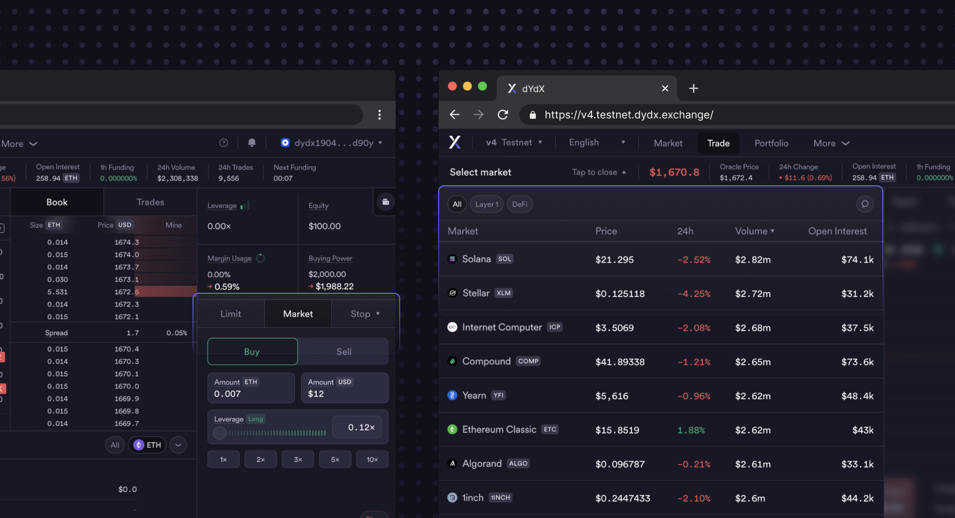
Order type selector: The front end will have an improved selector for order types, so traders can quickly choose the type of order they want to place, and get a simple description of the order type to confirm their intent.
Leverage selector: With a bespoke input designed to support both a slider and an input field, the leverage selector enables traders to both move fast and be precise, which is especially important given the cross-margined nature of dYdX software today.
Market selector & filtering: This new feature makes it easy for traders to select their desired market and filter results accordingly. You can also find the market you’re looking for with search, or even sort the list of tradable markets by price or market capitalization.
Command+K or Ctrl+K menu: There will be a Command+K or Ctrl+K menu to make it even easier for traders to navigate an interface using dYdX software. This allows traders to configure settings, navigate between markets, and even initiate trades from a simple and global shortcut menu.
Content organization
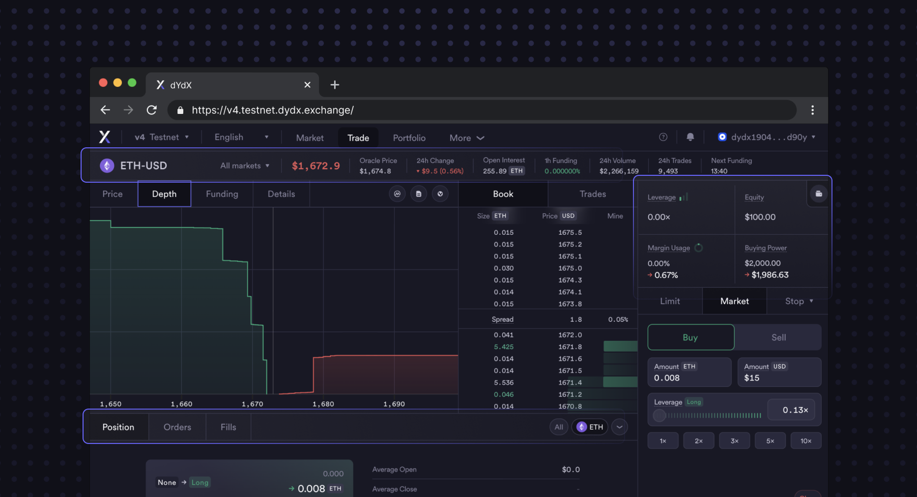
Tabbed sections: The interface is divided into easy-to-navigate tabs, so traders can quickly switch between different views. This also allows us to rapidly add new sections to the trade page in a scalable way. You’ll notice that there is no scrolling needed to navigate all of the different sections of the page at a traditional laptop or desktop screen size.
Statistics row in header: Traders can view important statistics at a glance with our statistics row in the header. This is will also be customizable, allowing them to determine which fields (and in which order) they would like to see them. This persistent and scalable design has inspired many other DEX interfaces.
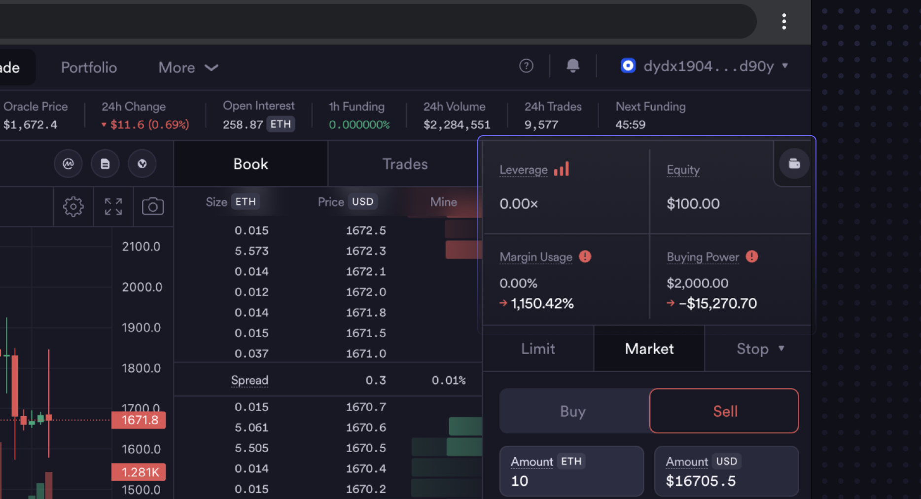
Account details and different states: Traders can easily view their account details and track changes over time. Seeing the change via comparison of before/after values for a given position or account drastically decreases the time needed to confirm trade details, enabling an effortless experience.
Customizability
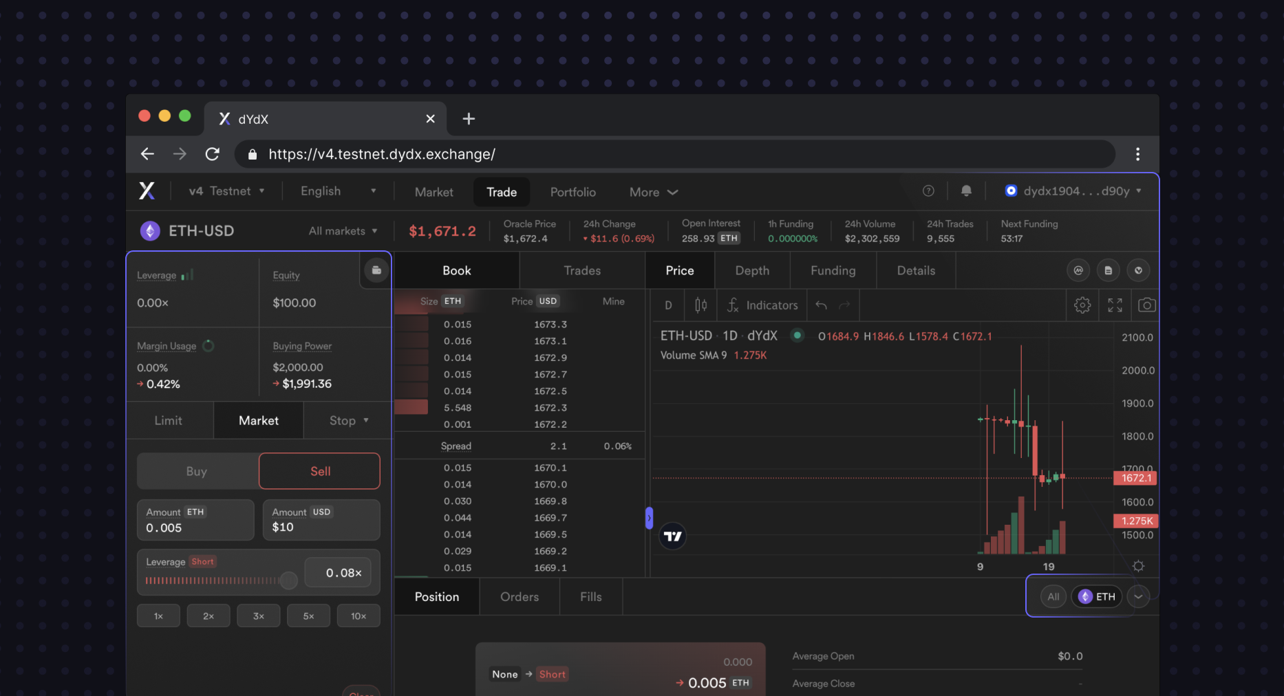
One vs. many positions: Traders can view either a single position or a list of all their positions, depending on their preference. This ensures that users do not lose track of their positions in other markets, and can quickly switch to them from the Position section in just one click.
Customizable layouts: Traders will be able to customize their trading interface by rearranging different sections to their liking. Prefer your trade box on the left, or the right? You don’t have to choose, as there will be layouts that support both!
Theming: Select between a variety of themes including Dark, Light, and Original via the Command+K or Ctrl+K menu. In certain lighting conditions, or based on personal preference, traders may want a fresh appearance for their interface. There could be support for custom themes in the future.
Edge Cases
An excellent trading experience solves for all user journeys, and therefore, it is important for us to think about about how the interface will behave in various edge cases.
Number overflows: The interface can handle large numbers without overflowing. The frontend intelligently truncate numbers into their shorthands (e.g. $5,200 would become $5.2k) to have predictable sizing and positioning of text fields.
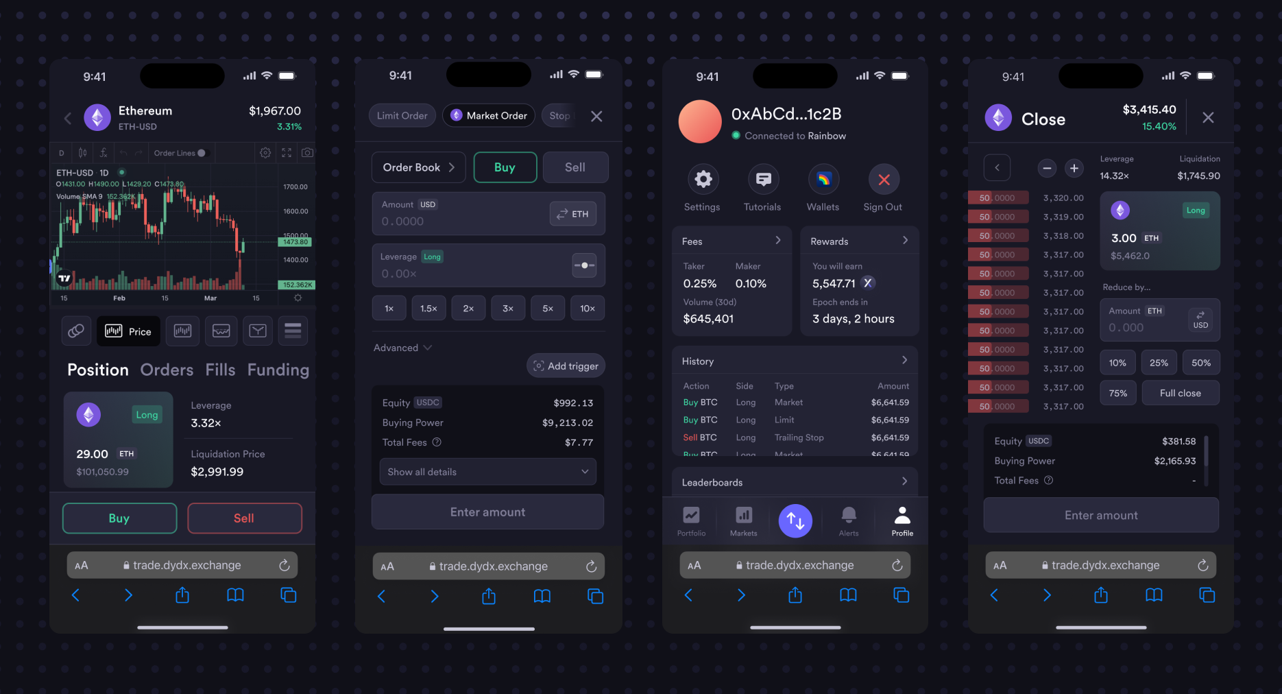
Responsive layouts: The exchange is designed to look great on any device. Whether you are using an ultra-wide monitor, laptop, tablet, or mobile phone, you can trade with ease. Traders can also minimize the positions section to make more room for other parts of the interface, allowing them to be fully immersed in market data.
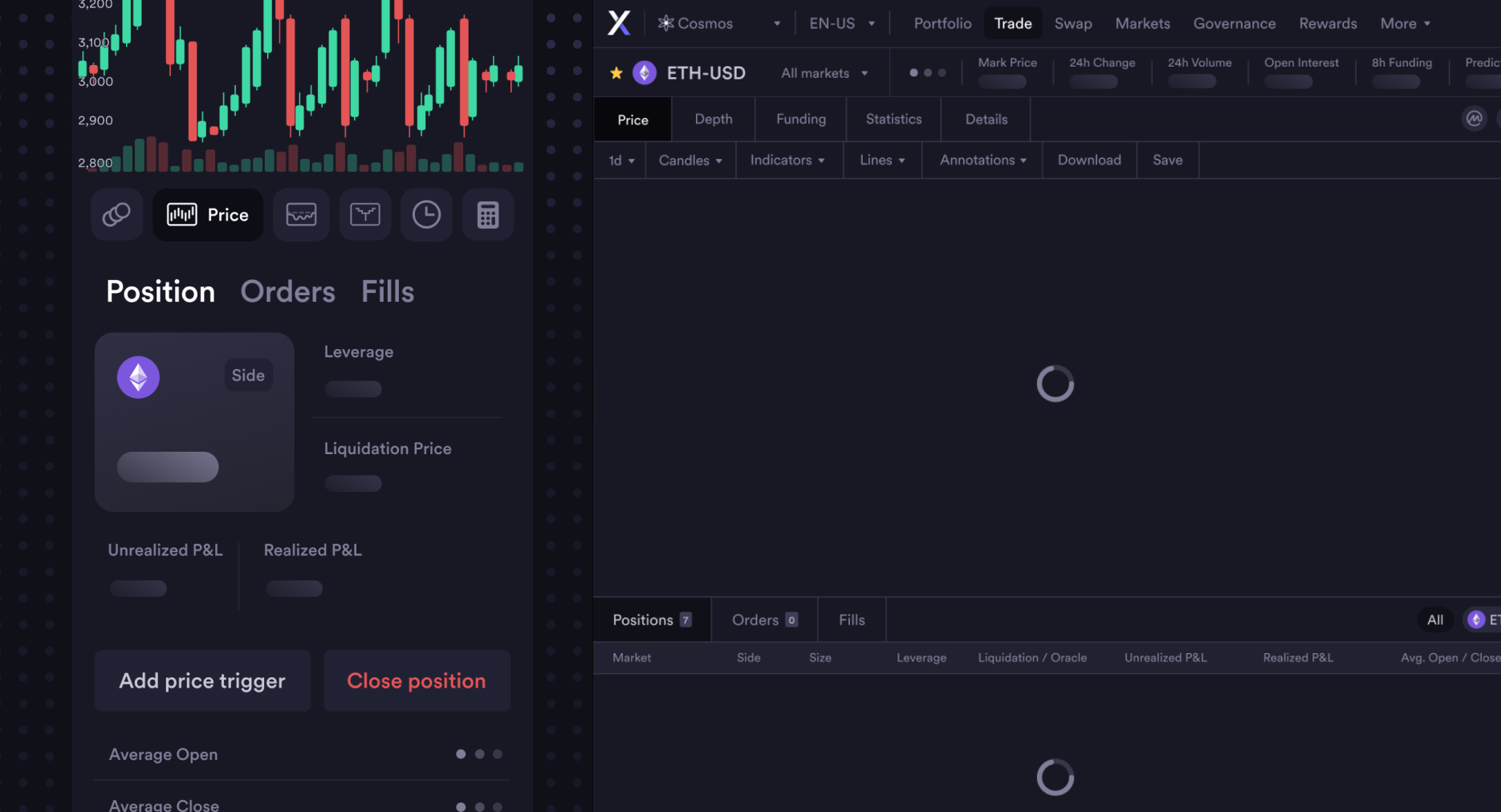
Loading states: This gives traders a clear indication that data is being retrieved from the network. This is especially important given that the upcoming version of dYdX will use decentralized hosting and APIs, which slightly increases page load and data fetching times.
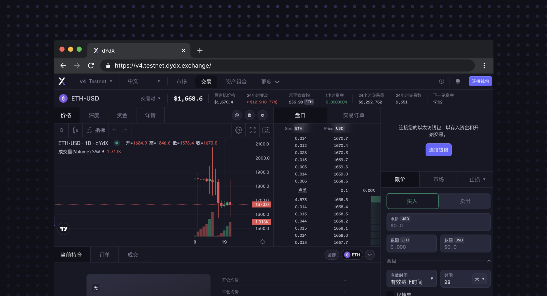
Translations: The platform has been exhaustively localized in a number of languages besides English, including French, German, Korean, Japanese, Chinese, and more. dYdX is a developer of global software that is designed for anyone, anywhere.
Summary
dYdX is committed to creating the best possible trading software to democratize financial opportunity in an emergent world of digital assets. We’re nowhere near done iterating on the interface, and there are many upcoming improvements and features that will continue to make the trading experience even better.
We hope you enjoy using v4, as much as its designers have enjoyed crafting it! Everyone is welcome to build their own interface around dYdX’s open infrastructure. If you’re interested in helping contribute to dYdX, don’t hesitate to apply to our team.
Terms and Conditions
This post is subject to the dYdX Terms of Use. dYdX products and services are not available to persons or entities who reside in, are located in, are incorporated in, or have registered offices in the United States or Canada, or Restricted Persons (as defined in the dYdX Terms of Use). Terms of Use specific to v4 software can be found here.